Text Input
 |
Any existing Text Input widgets with Number selected as Type will be automatically updated to a Number Input widget upon opening projects in Vuforia Studio 10.0 or later. This change does not affect widget bindings or appearance in Vuforia View.
|
What Does This Widget Do?
The Text Input widget is a one-line text box. It can be used for text data entry or to display text data in edit mode.
When Should I Use This Widget?
Use a Text Input when you want to include a one-line text box for an experience user to enter text data. For example, if you want a service technician to enter the condition of the oil in of a generator before they begin performing service maintenance, a Text Input widget would be most appropriate.
Are There Any Special Properties, Services, Events, or Actions?
To view a list of common widget properties, services, and events, see Common Widget Properties, Services, and Events.
The following table is a list of properties that are specific to this widget.
|
Property
|
JavaScript
|
Type
|
Description
|
|---|---|---|---|
|
Align
|
textalign
|
string
|
Select one of the following.
• Left
• Center
• Right
|
|
Label Position
|
type
|
string
|
Select one of the following.
• Placeholder—text box with only a placeholder attribute. Setting the label is ignored completely.
• Inline Label—label appears on the left and text input is to the right of it.
• Stacked Label— label appears at the top and the text input is below it.
• Floating Label— label appears at the top and the text input is below it.
|
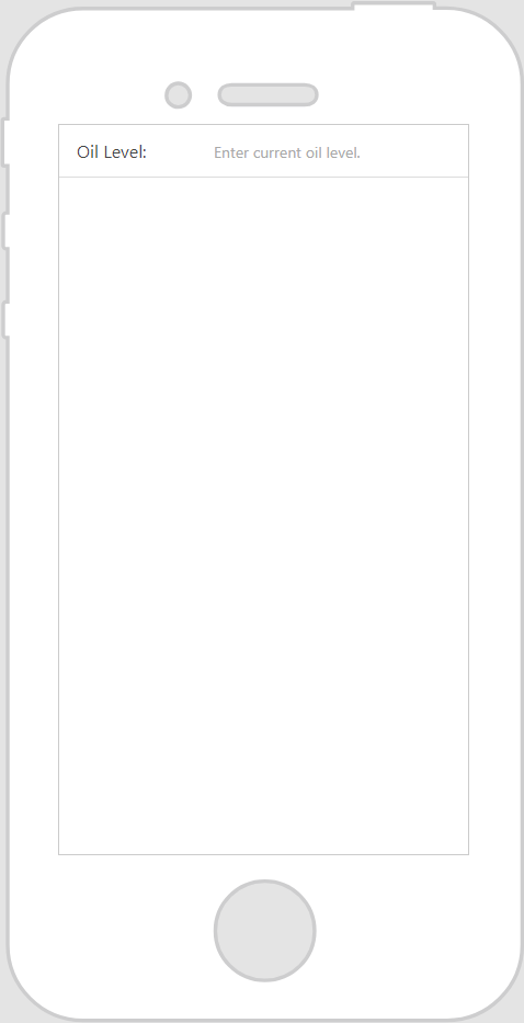
The Widget in Action
Here’s an example of what your widget might look like!
|
Minimum Steps Required for Use
|
What It Looks Like
|
|---|---|
|
1. Drag and drop a Text Input widget onto the canvas.
2. Enter placeholder text in the Placeholder field if you want to give the user some direction as to what should be entered in the text area. For this example, we’ve selected the Inline Label option for the Label Position property so we could pre-define what value we wanted them to enter to the right of the label. Then, the placeholder text we specified in the Placeholder field shows to the right of the Oil Level label.
|
 |