Lookup Search-Popup Window
SFM Lightning Delivery
The lookup search window is used to search records with advanced filters. The drop-down magnifier option from the lookup field launches the lookup search dialog box as shown on the following screen.
The following table describes the options available in the lookup search window and their functionality:
|
Options
|
Functionality
|
||
|---|---|---|---|
|
Pre-filter icon (
 ) ) |
This is used to view the list of Advanced filters applicable. When the filter area is in expanded mode, the pre-filter icon changes to a gray color. When the filter area is in collapsed mode, the pre-filter icon changes to a blue color.
|
||
|
Context Filters
|
This filter is displayed below the Keyword Search and will support fields of type Text and Picklist only.
|
||
|
Ellipses
|
Ellipses displayed at the end of the lookup fields are used to view the bubble information about the header and detail page layout.
|
||
|
Search button
|
Tapping the filter button displays all the applicable filters with checkboxes. Select the required filter checkbox to re-apply the filters and search again.
|
||
|
Adjustable column width
|
The column width can be re-sized. If long text area values are longer than the column width, it is truncated with ellipses (...). Hovering over the ellipses displays the entire text as a tooltip.
|
||
|
Number of Records Displayed
|
The lookup search results display a maximum of 1000 records based on the value set in the Number of Records to Return field in the lookup configuration. The default number of records displayed is 50. For more information, see Defining a Lookup Configuration.
|
 |
When you enter full or partial text in the lookup field and click Save (without choosing from the lookup dialog), and if there are no matches found, the message "No matching records found for this keyword: <<>> is displayed in the error panel.
|
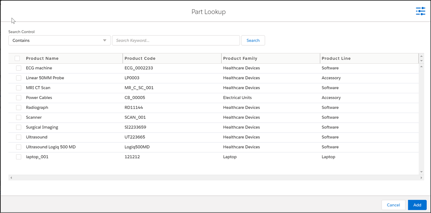
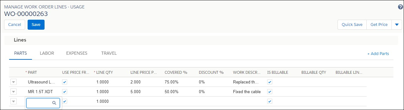
Single and Multi-Add Single-Add and Multi-Add parts are performed with the same Add Parts button.
|
|
The multi-add option is enabled only if it is configured in Page Layout. To configure it, select the Allow multi-add using the option in Page Layout > Tab Properties.
|
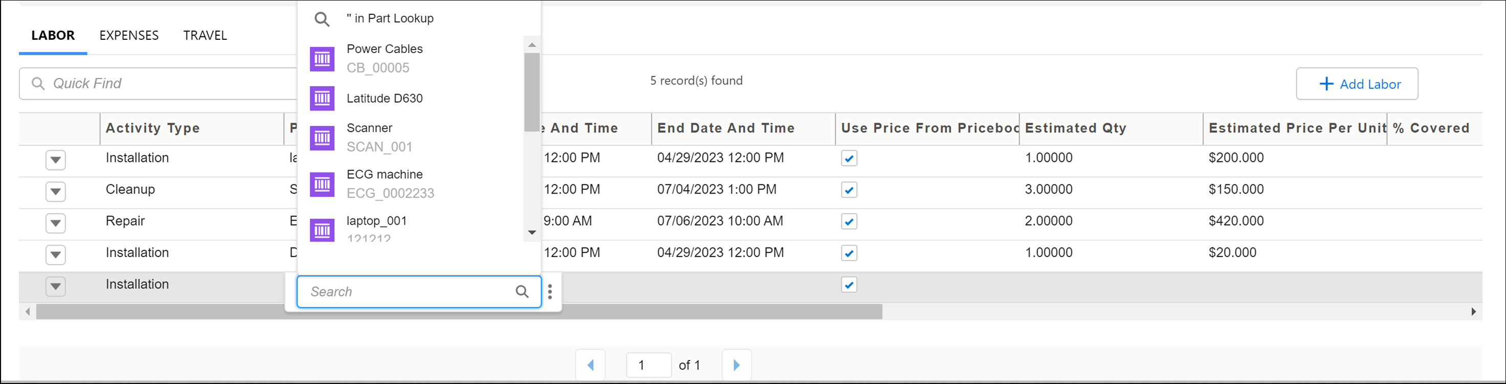
To add parts using a single add:
1. Click the fields from the child line to specify the required value. The first column has clickable text.
2. Select a record using the single-click option on the first column text or double-click anywhere in the record.
3. Click outside the child line section to come out of the edit mode.
4. Click Save.
To add parts using multi-add:
1. Click the Add Parts button to open the product search dialog box.
2. Select multiple parts that you want to add by clicking the respective checkboxes
3. Click the Add button. All the selected parts are added at the same time.
4. Click Save.
Classic Theme
The lookup search window launched by clicking the lookup icon without entering any keyword in the lookup field is shown below.
Following are the characteristics of this window.
• Lookup search result set displays fields based on one of the following, in the order listed:
• Custom or standard lookup configuration explicitly associated with the lookup field
• Custom lookup configuration is defined as the default lookup configuration for the lookup object
• Standard lookup configuration is defined as the default lookup configuration for the lookup object
• Name field of the lookup object
• The lookup object is automatically searched if any text is entered before launching the window.
• If no text is entered before launching the window, up to 10 recently selected records are displayed, and the lookup search is not executed.
• Recent records are displayed only if the global configuration setting SET003 is True. This setting (Suggest recently selected items in lookup search UI) is under the module SFM Transaction Manager and submodule SFM Transaction Delivery Engine.
• Basic, advanced, and context filters are not applied when recent records are displayed.
• The admin also configures the maximum number of records displayed in the result set (maximum value configurable: 250). Standard lookups show up to 50 matching records.
• To select a record, double-click the record or click the Select button on that record.
• You can close the window without selecting a record, by clicking the Cancel button or clicking outside the window.
• If you have set SET001 (Auto-populate lookup field when lookup search returns only one record, module SFM Transaction Manager, submodule SFM Transaction Delivery Engine) to FALSE, lookup search will open in a pop-up window. If you enter full or partial text in the lookup field and if a single match is found, a search is performed, and the result is displayed in the pop-up window.
• If you have set SET001 (Auto-populate lookup field when lookup search returns only one record, module SFM Transaction Manager, submodule SFM Transaction Delivery Engine) to TRUE, and if you enter full or partial text in the lookup field, click Enter. If a single match is found, search is performed inline and the matching record is displayed.
• When you enter full or partial text in the lookup field and click Save (without choosing from the lookup dialog), and if multiple matches are found, a message "Multiple items found. Click lookup icon to refine search" is displayed. If you click the Lookup icon after entering the partial text, the "Recent items" dialog is opened, and the text you entered is pre-filled in the Quick Find box, and the results are retrieved and displayed. Additionally, if you have set SET003 (Suggest recently selected items in lookup search UI) to TRUE, then recent articles will not be listed.
• If your user profile does not have field-level permission for any configured fields, those fields are not displayed in the lookup search window.
Lightning Theme
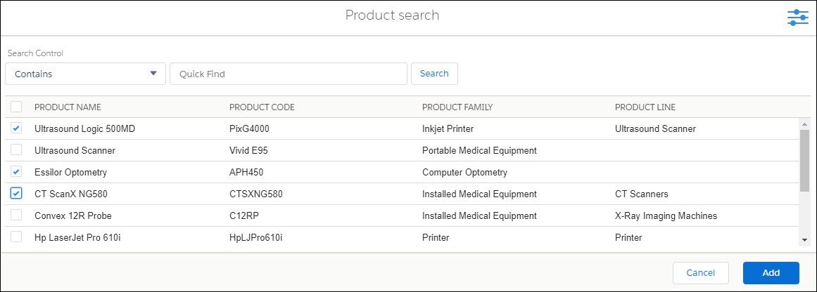
The lookup search window is used to search records with advanced filters. The drop-down magnifier option from the lookup field launches the lookup search dialog box, as shown on the following screen.
The following table describes the options available in the lookup search window and their functionality:
|
Options
|
Functionality
|
||
|---|---|---|---|
|
Pre-filter icon (
)
|
This is used to view the list of Advanced filters applicable. When the filter area is in expanded mode, the pre-filter icon changes to gray. When the filter area is in collapsed mode, the pre-filter icon changes to blue.
|
||
|
Context Filters
|
This filter is displayed below the Keyword Search and will support fields of type Text and Picklist only.
|
||
|
Ellipses
|
Ellipses displayed at the end of the lookup fields are used to view the bubble information about the header and detail page layout.
|
||
|
Search button
|
Tapping the filter button displays all the applicable filters with checkboxes. Select the required filter checkbox to re-apply the filters and search again.
|
||
|
Adjustable column width
|
The column width can be re-sized. If long text area values are longer than the column width, it is truncated with ellipses (...). Hovering over the ellipses displays the entire text as a tooltip.
|
|
|
When you enter full or partial text in the lookup field and click Save (without choosing from the lookup dialog), and if there are no matches found, the message "No matching records found for this keyword: <<>> is displayed in the error panel.
|
Single and Multi Add Single-Add and Multi-Add parts are performed with the same Add Parts button. To add parts using a single add:
1. Click the fields from the child line to specify the required value. The first column has clickable text.
2. Select a record using the single-click option on the first column text or double-click anywhere in the record.
3. Click outside the child line section to come out of the edit mode.
4. Click Save to save all the records.
To add parts using multi add:
1. Click the Add Parts button to open the product search dialog box.
2. Select multiple parts that you want to add by clicking the respective checkboxes
3. Click the Add button. All the selected parts are added at the same time.
4. Click Save to save all the records.